Why Simplicity Scales Up: An Introduction
In a world full of complicated shapes and showy decorations, a high-rise’s most potent message is frequently one of quiet confidence. This is the core of Minimalist Skyscraper Design, which is an architectural style that removes unnecessary elements to show the basic purity of structure, form, and material. It is a deliberate choice to avoid clutter and noise, claiming that in architecture, as in life, simplicity is not a lack of content but rather a mastery of it. This movement has done more than just make skylines look better; it has changed the way we think about verticality, technology, and beauty. Minimalist design gives a deep alternative to spectacle by following the saying “less is more.” It creates structures that are always beautiful, very useful, and unexpectedly long-lasting.
Where Vertical Simplicity Comes From: “Less is More”
Minimalism in high-rise building isn’t a new trend; it’s a philosophy that goes back to the early 1900s. German-American architect Ludwig Mies van der Rohe was its most important supporter. Mies didn’t see the skyscraper as a place to put up historical decorations; he saw it as the best example of the industrial age.
He started creating conceptual pieces like the all-glass Friedrichstrasse Skyscraper Project (1921), where he put out the groundbreaking idea of “skin and bones” architecture. This idea said that the building’s modern steel skeleton should hold the weight, leaving the outside walls (the “skin”) to be light, non-structural glass drapes. This revolutionary notion freed facades from their usual masonry role, making way for the sleek, unadorned glass boxes that now fill city centers. “Less is more” and “God is in the details” are two of Mies’s most famous slogans that still guide minimalist high-rise architecture. They show that true quality comes from careful refinement, not adding more.

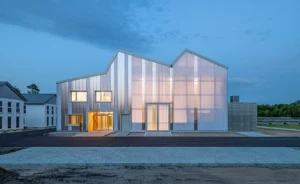
Minimalist architecture in Basel, Switzerland, featuring a white building with a striking geometric design.
Three Important Things About Minimalist High-Rise Design
The move toward modernist verticality is based on three main design features that architects carefully manipulate to create a sense of tranquility and clarity on a large scale.
Form and Geometric Purity
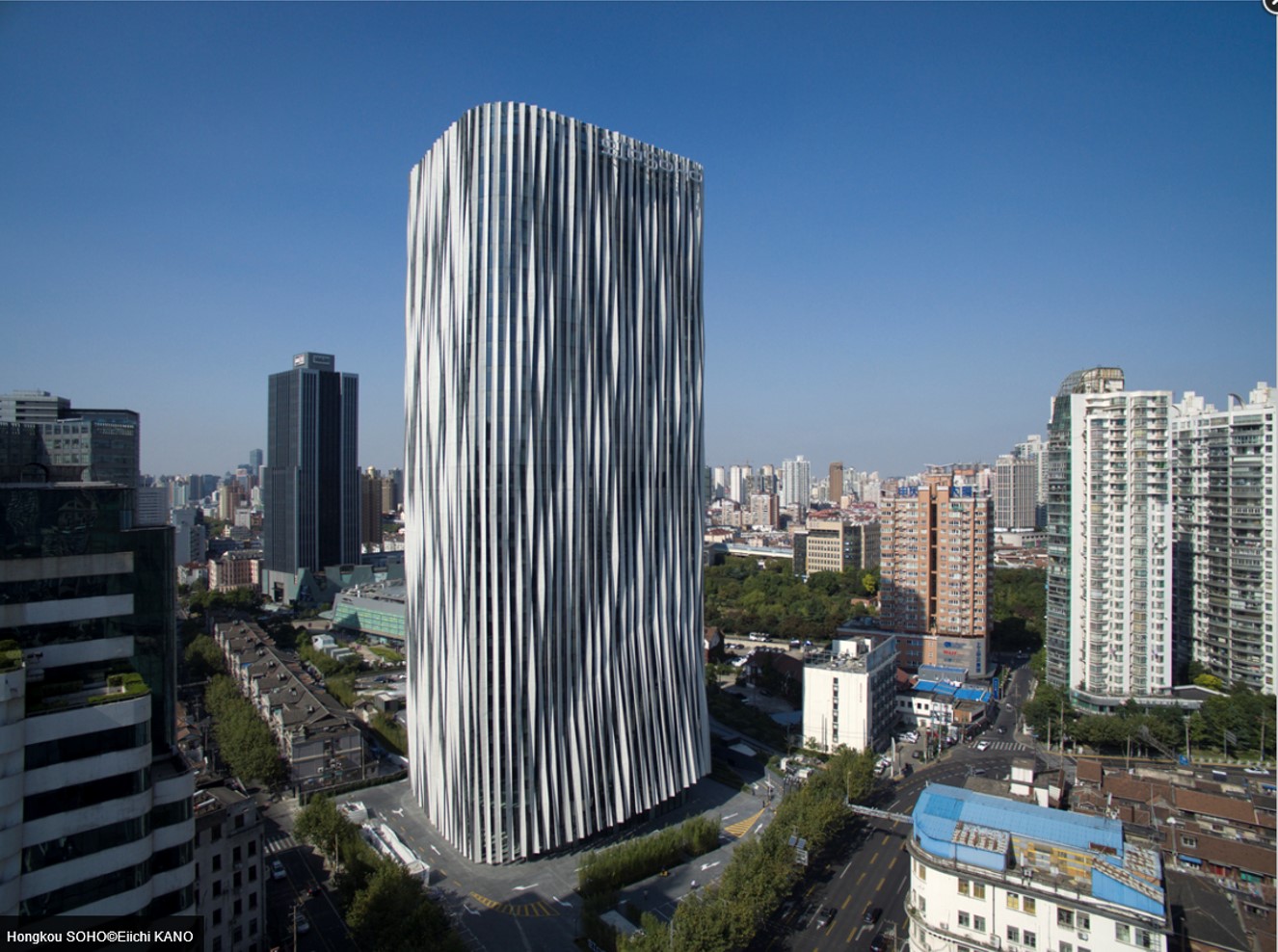
Minimalist skyscrapers put a lot of emphasis on clear shapes. The design is mostly made up of squares, rectangles, and straight, sharp lines. This focus on simple shapes is more than just a design choice; it shows order and honesty in structure. The architect draws the viewer’s attention on the building’s size and shape by getting rid of curves, extra projections, and artistic touches. The building is a basic, imposing monolith that often uses repeated shapes (such the same floor plates and window modules) to create a visual rhythm that is both calming and grand. This repetition makes a harmonic front that is easy to understand, and it gets complicated by being simple.
Honesty and texture of materials
The honesty of materials is a key part of minimalist design. High-rise minimalists don’t hide structure beneath decorative cladding; instead, they highlight the raw, natural beauty of industrial materials.
- Glass: Used a lot to blur the line between inside and outside, letting in as much natural light as possible. A clear glass curtain wall makes a facade that reflects the sky, weather, and surroundings, making the building lively without needing any decorations.
- Steel: Steel frames show the tower’s structural truth, either by being revealed or by being quietly represented. Mies was known for placing I-beams on the outside of buildings, not because they were necessary for the structure, but because they showed off the structure underneath. This turned a functional feature into an artistic statement.
- Concrete: When used, concrete is generally left bare (béton brut) so that its natural texture and color (a neutral gray) may come through. This substance is a solid, anchoring counterpoint to the lightness of glass.
The usage of only white, black, and different hues of gray and glass green keeps the focus on the texture and fine details of these materials.
The Smart Use of Light and Space
The lack of an object, like space and light, may be the most advanced tool in the minimalist architect’s toolbox. Minimalist design combines big windows and open floor plans in a smart way to let in as much natural light as possible. This lessens the need for artificial light, which is an important part of sustainable design, and makes the tower feel like it has a limitless amount of space. The lack of decoration, or the vacuum, is what gives the architectural parts their most strength. When there is nothing else to look at, the light on a polished concrete wall or the sharp, clear shadow of a steel column becomes the main form of art.
Case Study: The Famous Minimalist Towers
No study of minimalist high-rise architecture is complete without looking at the famous buildings that made this style a global norm.
The Seagram Building is in New York City
The Seagram Building, which was finished in 1958 and designed by Mies van der Rohe and Philip Johnson, is probably the best example of a minimalist skyscraper. It is a flawless, bronze-tinted glass slab set back from Park Avenue by a huge, open granite plaza. This is an unprecedented act of kindness in busy Manhattan. The vertical bronze I-beams on the outside are what people love most about it. Mies used these non-structural bronze ornaments to add visual interest and rhythm to the façade, showing that he believed “God is in the details.” The main structure is made of steel. Its dark, basic shape shows how luxury may be obtained through austerity, which is a really modern verticality.
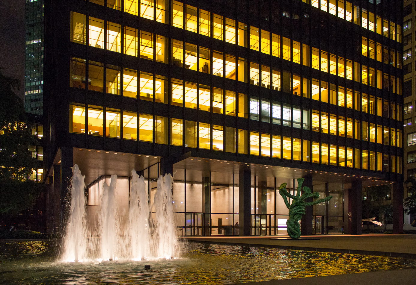
The Seagram Building is in New York City
860–880 Lake Shore Drive in Chicago
People generally say that these two apartment towers, which were finished in 1951, were Mies’s first example of the “skin and bones” style in residential high-rises. Their rectilinear purity is striking, and they have glass curtain walls framed by a visible steel structure. The buildings are clean, beautiful boxes that show how form follows function. They show how glass and steel, two common materials, could be utilized to make fancy, high-end homes in cities. The modular form that repeats itself is quite useful and gives the Chicago lakefront a cohesive, unified look.
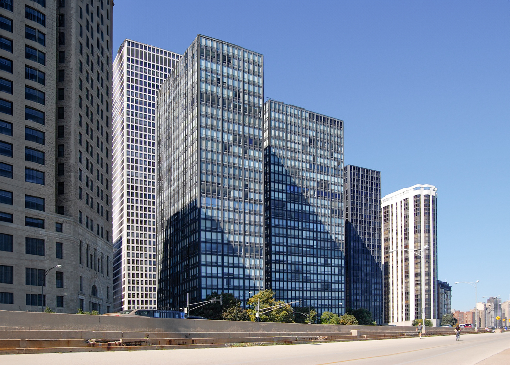
860–880 Lake Shore Drive in Chicago
A Green Ethos: Simplicity as Sustainability
The main idea behind minimal design is to strip things down to their most basic form. This has a direct impact on sustainability.
- Less Embodied Energy: Architects use fewer materials when they focus on basic materials like concrete and steel and stay away from complicated cladding or decorative finishes. This lowers the building’s overall embodied energy.
- Durability and Longevity: Minimalist design prefers materials that are high-quality and long-lasting (quality over quantity). This promise to use long-lasting materials means that the tower won’t need to be repaired or replaced as often, which cuts down on construction waste over its lifetime.
- Passive Design: Using wide, clear glass surfaces (together with current, energy-efficient glazing technology) lets in the most natural light, which means less need for artificial lighting and less energy use in general. The clean shapes are also often better for aerodynamics.
Minimalist design is not only a style; it is a way of thinking about the economy and the environment that encourages saving resources and being efficient.
Conclusion: The Lasting Vertical Legacy
The Minimalist Skyscraper has made its mark on architectural history by showing that beauty doesn’t have to be complicated. These towers show us how to build a future skyline that is calm, useful, and very attractive by sticking to simple designs, honest materials, and practical purity. The phrase “less is more” in a vertical way still inspires architects to build not just taller but also smarter.
Reference:
Minimalist Architecture: Design and Principles | ArchitectureCourses.org
Explore Minimalist High-Rise Building Design with Mindjourney Prompts-AI Architectural
For more content like this CLICK HERE!