The New Honesty in Digital Design: An Introduction
For more than ten years, the digital world has been trying to achieve one aesthetic goal: smooth, polished, and frictionless. This very elegant style has defined “good design” with its smooth gradients, soft shadows, and flawlessly balanced layouts.
But a strong counter-trend is starting to take shape, propelled by a general weariness with digital perfection.
Minimal Brutalism is the aesthetic reaction to this tiredness. It combines architectural Brutalism, which is about raw, exposed construction, with functional Minimalism, which is about clarity and focus. The end result is a design philosophy that is honest, unapologetic, and powerful. It gets away of the subtle hints that are common in standard user experience (UX) design in favor of grids that are easy to see and high-contrast, and text that is too big and uncomfortable. It demands attention through sheer rawness. This change isn’t simply about style; it’s a purposeful step toward open communication in a time when algorithms are hard to see.
After AI, Visual Fatigue: Looking for the “Real”
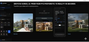
The fast growth of generative AI has led to an unanticipated design crisis: the rise of the perfectly polished yet soulless image. AI models are great at making ideal compositions that follow all the criteria of aesthetics, which results in a huge amount of stuff that all looks the same.
People are getting tired of “algorithmic conformity,” which is causing a backlash among consumers. One survey says that customers are actively rejecting creative content made by AI, especially when it seems fake or low-effort. This is mostly because younger people are pushing back against it.
The Rejection of the Smooth Surface is immediately opposed by Minimal Brutalism. It serves as a visual indicator of human authorship by purposefully adding flaws and roughness.
Some of the main things that make this “Post-AI” real are:
Exposed Structure: grid lines that are easy to see, HTML elements that aren’t stylized, and blocky layouts (Source 1.2). This transparency shows the “raw materials” of the digital media, just like Brutalist building shows concrete.
Harsh Contrast: The use of monochromatic palettes, usually black, white, and one bright accent color, makes text easy to see right away and goes against the soft color fields of current design.
Oversized Typography: Typography is more than simply words; it’s a part of the structure. Bold, geometric, and occasionally conflicting fonts fill the screen. They put clarity and message over visual beauty.
This was built by a person, according to the aesthetic. It’s not predictive; it’s deliberate.
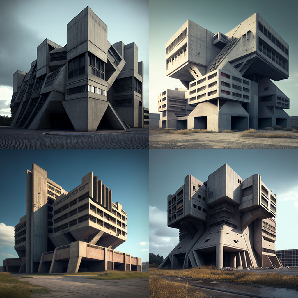
Source: prompthero.ai
The Anti-Corporate Aesthetic: What Gen Z Likes
Minimal Brutalism’s raw, counter-cultural style fits perfectly with what Generation Z cares about. Gen Z values honesty, openness, and purposeful imperfection since they grew up with carefully chosen social media feeds and highly individualized digital experiences.
Realness above polish
People in this generation don’t trust the polished, business look that often hides a lack of depth. People don’t see the lack of polish in Minimal Brutalism as bad design; instead, they see it as a sign of honest, open intent. The style is a strong symbol of identification that brands, creative firms, and artists commonly use to show:
Rebellion: Not going along with the “aesthetic sameness” of mainstream internet culture.
Focus: A promise to stay on task and not be sidetracked.
Individuality: The layout and color choices are often experimental, which shows how Gen Z values being free and not following the rules.
People are also tired of too much marketing, which makes them feel like they’re being manipulated when they get too many or too targeted messages. Because it doesn’t strive to promote a flawless fantasy, a design that seems “broken” or raw breaks through this cacophony.
For example, Balenciaga has employed Brutalist web design to focus the buyer’s attention on the product itself, removing distractions and making it easier for them to focus on the main offering. Other examples, like Studio Brot or Freak Mag, use unusual layouts and high-contrast images to fit with a creative, edgy style.
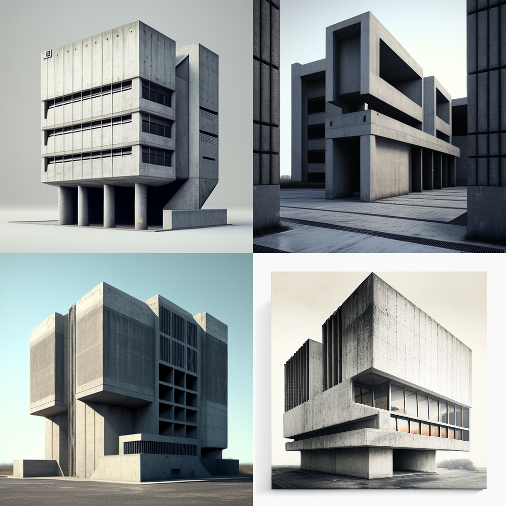
Source: prompthero.ai
Translating Digital to Physical: Full Circle Functionality
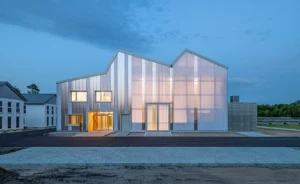
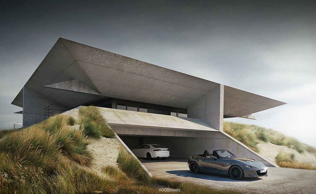
Minimal Brutalism began as a protest in the digital world, but its ideas are now coming back into the real world, completing an architectural complete circle. Not only is this approach bringing back the hefty concrete shapes of buildings from the 1960s, but it is also using the digital idea of “exposed structure” in modern homes and businesses.
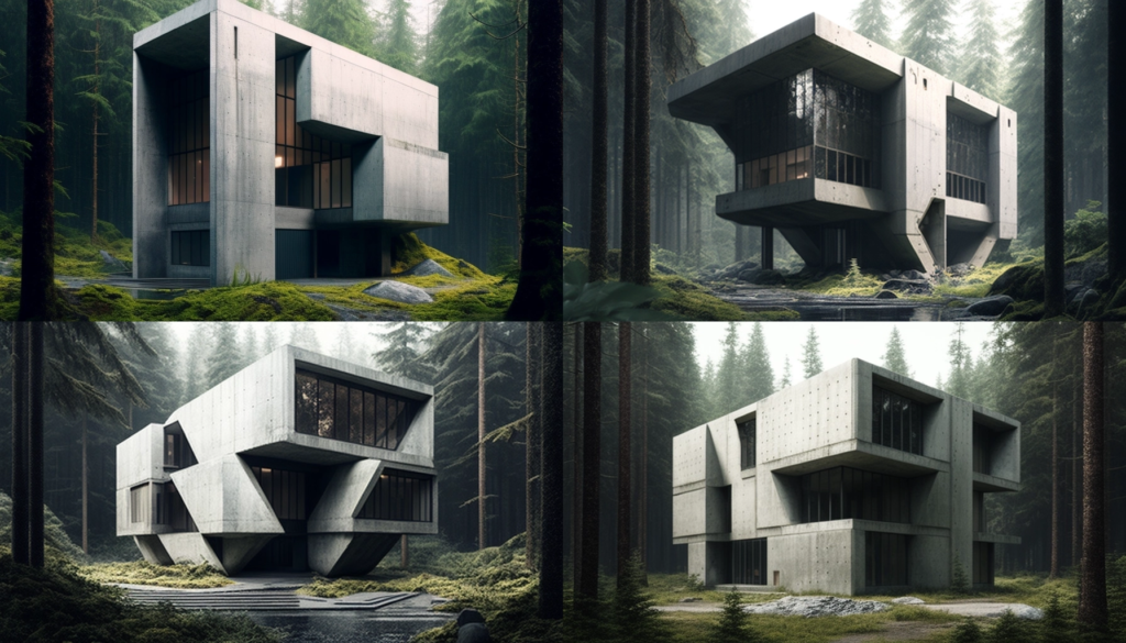
Source: prompthero.ai
From Code That Is Open to Utilities That Are Open
This translation shows up in physical design as:
Honest Materiality: Using materials in their raw, untreated state, including exposed concrete (béton brut), unpolished wood, or visible steel beams. This is similar to the digital idea of showing the underlying HTML structure.
Utilitarian Focus: Putting more value on how a space works than on how it looks. The designs are simple, geometric, and made to last and work well.
Intentional Asymmetry and Volume: Using big, blocky shapes and bold, simple forms to make rooms that seem substantial and grounded. This gives you something real to hold on to in a world that is always changing.
This physical beauty gives people who live there a sense of stability. As work, communication, and leisure become more abstract and virtual, the unyielding, tangible presence of Minimal Brutalist forms gives us a sense of weight and permanence that we need.

Inspirational Brutalist house exteriors// pinterest.com
The Future of Clear Design
Minimal Brutalism is not just a passing fad; it is a major change in how designers and consumers are dealing with the world after AI. It shows that you have made a conscious choice to value honesty over deception, usefulness over fluff, and openness above perfection.
If you want to develop real trust with a skeptical, design-aware audience, embracing the intended roughness of Minimal Brutalism can help you do that. In a world full of perfect algorithmic content, being different means being brave enough to be perfectly imperfect.
It’s not finer gradients or rounder corners that will make design interesting in the future. It’s the raw, digital material that is honest, open, and completely human.
Reference:
Raw Rebellion: How Brutalist Design is Reshaping Digital Aesthetics | Design Magazine
For more blogs like this CLICK HERE!!