The New Honesty: Adopting the Raw Aesthetic of Brutalism in the Digital Era
The digital world has devolved into a sea of uniformity. Driven by pre-packaged themes, usability frameworks, and an unrelenting quest for “clean” and “sleek,” contemporary websites and applications frequently have a uniformly polished appearance. Every arrangement is pleasantly predictable, every gradient is delicate, and every corner is rounded. Despite being safe, this design uniformity has left a gap in authenticity.
Minimal Brutalism is a bold, unrepentant style that has arisen in response.
This aesthetic is a conscious rejection of surface-level gloss and a statement of visual honesty. It reveals the bare, unpolished structure underneath the decoration. It is blocky, noisy, and compels viewers to focus on the material at hand. Brutalism is more than simply a fad for designers and marketers looking to make a statement; it’s a strong statement that utility and transparency are more important than artificial beauty.
From Pixels to Concrete Towers: Define Digital Brutalism
The style that we now refer to as brutalism originated in concrete rather than on a screen. Reyner Banham, an architectural historian, first used the phrase in 1955 to characterize a post-war trend that favored exposed, raw materials, most notably béton brut (raw concrete). Large, block-like forms, strict utility, and a reluctance to conceal their construction are characteristics of brutalist architecture, such as those of the Yale Art and Architecture Building and the Barbican Centre in London.
A direct application of this theory to the internet is called “digital brutalism.” It deliberately deviates from the current standards of sleek, user-friendly design, making it anti-design.
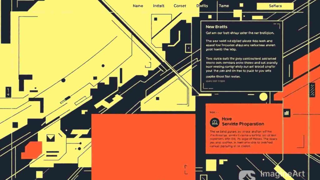
The Features of the Unprocessed Web
In actuality, the following characteristics characterize a brutalist digital design:
- Exposed Structure: Unstyled buttons, visible HTML elements, and blue hyperlinks by default are examples of exposed structure. Sharp borders and outlines are frequently used to highlight the grid.
- Monochrome and High-Contrast Palettes: Using stark, intense hues like neon green or harsh yellow, or preferring black lettering on a white background.
- System, Bold Typography: Bold, blocky fonts that are frequently monospaced or plain sans-serif. The main ornamental element is typography.
- Function Above Form: Each component has a specific function. There isn’t any secret animation or delicate gradation. It does precisely what you see.
The Cultural Reaction: The Reasons Behind Designers’ ‘Ugly’
The 2020s saw a rebirth of the brutalist aesthetic, which is essentially a cultural response. It’s a reaction to a digital world that is seen as being too carefully manicured, corporately sterile, and visually identical.
Authenticity is a key message that designers are conveying with this approach. A Brutalist UI conveys honesty at a time where polished startup aesthetics are the norm. It reads: “We are focused on the content, not the marketing fluff.” The “New Honesty” that consumers seek—especially younger generations who are increasingly skilled at identifying fake branding—is this genuineness.
Brutalism is also a type of digital nostalgia. The raw, unpolished appearance of the web’s early years, in the late 1990s and early 2000s, before bandwidth and commercial pressure imposed the current, highly optimized visual standard, is purposefully referenced. It reminds the user that the internet is a place of limitless possibilities rather than only a shopping center for commercial interests by adopting retro patterns.

Urban furniture, Collevalenza-Todi. Julio Lafuente (1953-1974).. Image © Stefano Perego
SEO and Brutalism: An Odd Combination for Outcomes
Surprisingly, Minimal Brutalism, an aesthetic that is sometimes viewed as “ugly,” is a champion for SEO. The design’s fundamental ideas are in complete harmony with Google’s emphasis on Core Web Vitals (CWV) and performance.
Optimizing for Clarity and Speed: Lightning-Quick Loading By design, brutalist websites use system typefaces, no CSS, and no sophisticated JavaScript libraries. This results in remarkable rankings for Largest Contentful Paint (LCP) and overall load speed by significantly reducing the file size (payload).
Optimal Readability: The best color combination for screen readability is black text on a bright white or highly contrasted backdrop, which is the default setting. This clarity enhances the user experience, which benefits search engines by reducing bounce rates and increasing dwell time.
Transparent Information Architecture: The information’s structure (H1, H2, and H3 tags) must be clear and logical since there is no design fluff to conceal it. This improves topical relevance and indexation by enforcing a clear, structured code structure that search engine bots can readily scan and comprehend.

Source: istock.com
Case Studies: The Digital Designs That Show No Remorse
A number of well-known companies have successfully used aspects of this unpolished style to convey authority, openness, or a daring creative vision.
- Bloomberg: The media behemoth’s markets division is a prime example of minimal brutalism. It conveys complex financial facts with the highest authority and clarity by using bold, dense text, a high contrast color scheme, and severe lines. Its design puts speed and accuracy of information consumption ahead of aesthetic delicacy.
- Balenciaga: The high-end fashion brand frequently uses a minimalist, blocky, and monochromatic site design. This decision demonstrates a dedication to structure and concept over traditional beauty standards and is consistent with their avant-garde, occasionally confrontational corporate identity.
- Brutalist Websites: The Brutalist Websites collection is the leading online display of this movement, despite not being a for-profit website. It encourages designers to test the limits of traditional UI/UX by acting as a living, breathing example of the possibilities of unpolished, raw design.
Putting the Raw Aesthetic into Practice (A Brief Guide)
Start with these unchangeable guidelines if you’re thinking of using this style in your work:
- Make the Grid a Priority: Establish a clear, block-based grid with rigid boundaries.
- Restrict Your Color Scheme: Limit yourself to one highly saturated accent color and two primary colors, such as black and white.
- Prioritize Function Above All Else: Remove any motion or decorative element that doesn’t directly support navigation or communication.
- Adopt System typefaces: To emphasize the concept of naked, unpolished efficiency, use default typefaces such as Arial or Courier.
Conclusion: An Attention-Grabbing Aesthetic
More than just a passing fad in online design, minimal brutalism is a reflection of the need for genuineness in a digital world that is becoming more and more artificial. It is a code translation of the honest architectural ethos.
A strong sense of authority and transparency is produced by the aesthetic’s removal of the over-design layers. It takes guts to show off the structure, to forgo the polished corporate appearance, and to have the audacity to be unabashedly raw in order to make an impression. The New Honesty of the Brutalist aesthetic will only become more relevant as the digital realm continues to strive for speed and authentic user connection, demonstrating that structure, purpose, and a hint of industrial grit can be the ultimate form of sophisticated design.
Reference:
Brutalism Digital Design: Embracing Raw Aesthetics | by Think Design | Medium
Raw Rebellion: How Brutalist Design is Reshaping Digital Aesthetics | Design Magazine
For more blogs like this CLICK HERE!!