The internet should work well. It should look nice, with smart UX, soft gradients, and subtle shadows. For years, a style dubbed Minimalism has taken over every part of the web, from huge online stores to personal portfolios.
But what happens when perfection gets too much? What do designers and users do when all the websites, apps, and interfaces start to look the same?
They fight back.
Digital Brutalism is a radical aesthetic that has come back to life in a dramatic and stunning way that goes against the polished norm. This is more than just a design trend; it’s a message. It’s a deliberate embracing of the rough, the chaotic, and the unpolished, fueled by a deep, shared longing for the wild, real history of the internet. It’s like an exposed concrete facade in the digital world—raw, honest, and completely indelible.
The Raw Concrete of the Web: What Digital Brutalism Is
Digital Brutalism comes from the Brutalism style in architecture in the middle of the 20th century, which famously championed béton brut (raw concrete). These buildings, which were big, useful, and plain, were a clear rejection of classical forms that were more delicate.
In the digital realm, this attitude means getting rid of the extra stuff to show the web’s essential building blocks: HTML and simple CSS.
Important Parts of a Brutalist Design:
- Bold, Aggressive Typography: Fonts are typically too big, too plain, or too monospaced (like an ancient computer terminal). They demand attention, putting clarity of message above of visual comfort.
- Clashing Color Schemes: Forget about color schemes that go well together. Brutalist sites generally use severe black-and-white or high-contrast primary hues that clash with each other, like bright yellow against harsh red. The goal is to make things look tense and not polished.
- Asymmetry and Exposed Structure: Layouts are often strange, with gridlines that are easy to see, elements that overlap, or flaws that are meant to be there. Instead of hiding the web page’s structure, it is praised.
- Function Over Ornament: There aren’t many interactive features. It’s easy to get around, usually with plain blue links or box buttons that don’t have any style. If an element doesn’t have an important purpose, it is removed.
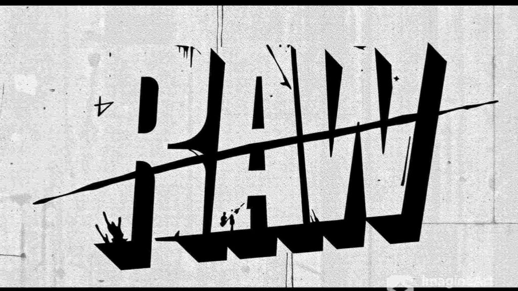
Brutalism graphic design
The Monoculture Crisis: A Fight Against Being the Same
The return of Brutalism is, at its core, a strong response to “Design Fatigue.” For the last ten years, the web has been getting more and more like a “Dribbble-ized” world, with slick, simple interfaces that look the same. This sameness is safe, but it’s not really interesting.
Brutalism is the power that can disrupt this trend.
Modern minimalism looks for simplicity by refining things and making sure that every detail is just right. Brutalism, on the other hand, looks for simplicity by leaving things out. Brutalism wants to look authentic, while minimalism wants to look nice.
A Brutalist website is an instant sign of nonconformity for creative agencies, artists, and rebellious brands. It says, “We are not like the others.” We are sure of what we want to say and don’t need to polish it too much to impress you. This raw style makes a brand stand out right away, giving it a unique, memorable presence that cuts through the noise of the internet.
The Labyrinth of Experience: Why We Want the Mess
The word “nostalgia” in our title is what makes Digital Brutalism so appealing.
For people who grew up with the internet, the brutalist style reminds them of the “Wild Wild West” of the 1990s and early 2000s. Think of the Drudge Report or the early days of Craigslist. They had simple HTML, blue underlined links, clumsy tables, and no consideration for advanced graphic design.
This design style makes me think of a digital frontier, a time when surfing the web was like going on an adventure, a “labyrinth of experience,” when finding a strange, unfinished site felt like finding a secret treasure.
The modern, slick web is easy to use, but it doesn’t have the personality and soul that the old, messy web did. Brutalism brings back that realness. It feels real, genuine, and homemade, which appeals to people who are tired of digital encounters that have been extensively filtered and curated. The flaws become endearing, and the discomfort draws attention, which makes people more interested. It’s a throwback to when big companies didn’t set all the rules for UI and UX on the internet.
Functionality in the Fracture: The Harsh Benefits
Brutalism may not look inviting at first, but its messy outside hides a number of utilitarian benefits that are important to modern online design.
The “bare-bones” structure philosophy leads directly to good performance. Brutalist websites are very light since they don’t employ much CSS, animation, or heavy images.
- Fast Load Times: Pages load instantly because they have fewer decorative features. This is very important for SEO, keeping users on your site, and making it easy to use, especially on mobile devices.
- Material Focus: The lack of distractions, like fancy animations or elaborate transitions, makes the user pay more attention to the main material, which makes it easier to read and understand.
- Accessibility (Ironically): High-contrast writing and simple, organized HTML can frequently make things easier for people with vision problems to utilize, as long as the code is tidy.
Brutalism is basically a strong, useful answer to the problem of the current web’s bloat. It says that greatest effectiveness doesn’t need maximal decoration.
Neo-Brutalism: Bringing the Rebellion Together
Brutalism in its purest form can be too severe for most people, yet the style has changed into Neo-Brutalism. This new style keeps the basic ideas of rawness and honesty but adds some thoughtful touches to make sure users have a good time.
Neo-Brutalism commonly has:
- Thick, bold lines and borders surrounding things.
- Use bright, saturated hues (such neon pinks or electric blues) in a pleasant way on top of functional, organized patterns.
- Drop shadows that are planned and delicate to produce a tactile, “floating” sense, like layered paper.
This mixed approach lets firms, like high-end fashion brands and cutting-edge software startups, use the unique and unforgettable look of Brutalism without fully giving up on modern UX standards. It’s the perfect place where chaos and planned design meet.
Conclusion: The Future is Not Polished
Digital Brutalism is not just a passing trend; it is a deep cultural critique. People will always be interested in a movement that embraces the untidy, the real, and the raw in a world when digital spaces are mostly clean.
Digital Brutalism gives creative professionals a strong approach to stand out by tapping into a shared nostalgia for the internet’s chaotic adolescence and using a shocking visual statement. It shows that sometimes the best design is the one that isn’t afraid to seem rough around the edges. This makes for a real, interesting experience that really resonates with people. People are starting to question the hegemony of clean, consistent design. The time of beautiful, chaotic turmoil has begun.
Reference
Digital Brutalism: The Internet’s Love Affair with Clashing, Chaotic Design – Antonio P Argueta
Brutalism Graphic Design: Raw Aesthetics & Bold Visuals Explained
For more blogs like this CLICK HERE!!