The Monoculture of Minimalism
Brutalist minimalism has been the main design concept on the internet for almost ten years. Minimalism promises clarity, elegance, and ease of use with its simple lines, lots of white space, and soft colour schemes. This style is gorgeous and works well, but it has made things a little too similar. It can be easy to feel like you’ve seen it all before when you browse the web today. Many platforms, from e-commerce sites to personal portfolios, have started to look and feel the same: smooth and polished.
A new and unabashed movement has come out of the digital underground in response to this aesthetic homogeneity. It values rawness over polish, function over form, and being real above being perfect. Welcome to the time of Brutalist web design.
What is Neubrutalism, or Brutalist Web Design?
Brutalist online design, or more precisely, Neubrutalism, is based on the mid-20th-century architecture style of the same name. Brutalist architecture embraced raw, exposed concrete (béton brut). Its digital counterpart cuts away the trimmings to show the naked bones of the web: raw HTML, stark typography, and unpolished images.
This style isn’t about being “bad” or “ugly” just to be “bad” or “ugly.” It’s a choice that was made on purpose and for a reason. Brutalist web design is all about putting content first and making sure that everything works and is honest. It’s about breaking the rules of traditional design and making an online identity that stands out and is memorable.

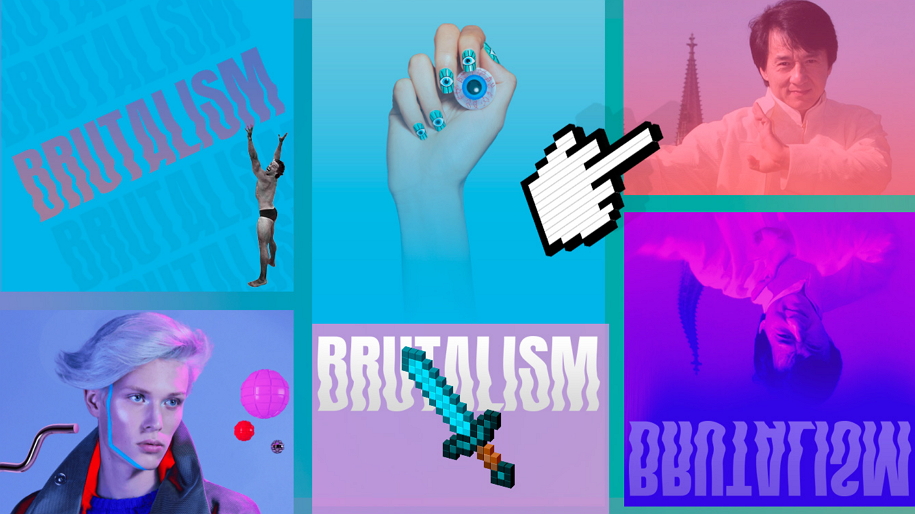
What Makes a Digital Brutalist Unique
You can tell right away that a website is Neubrutalist. It doesn’t like the soft gradients and subtle animations of modern design. Instead, it wants something more direct and confrontational.
- Aesthetic that is raw and unpolished: There are no smooth, rounded corners or subtle drop shadows. Instead, thick, solid black lines and bright, flat colours define the elements. This makes the design look “real,” like it was made with real blocks.
- Bold and Unconventional Typography: Forget about decorative fonts. Use bold and unusual fonts instead. The focus is on a few simple, easy-to-read fonts, usually monospaced, but used in a bold way. Text can be too big, stacked in a strange way, or even used as the main visual element to draw the user’s attention and guide their eye.
- High-Contrast Colour Palettes: Neubrutalism sometimes uses colours that clash or are very brilliant, like neon yellow, bright red, or electric blue, with pure black (#000000) as the main colour. This makes a striking visual effect that you can’t miss.
- Intentional Imperfection: The design accepts a certain amount of “messiness.” Layouts can break traditional grid systems and be uneven. Things might overlap or be put in places you didn’t expect. This planned disarray contributes to the raw, rebellious spirit and makes the site stand out from all the other sites that are neatly aligned.

Why now? A Reaction to Sameness
The rise of Brutalist web design is a direct response to a few important trends in the digital realm.
The Minimalist Backlash
The look of minimalism, while exquisite, can feel sterile and devoid of soul. As designers and brands want to differentiate themselves, the raw, expressive essence of Neubrutalism offers an appealing option. It’s a method to break through the noise and convey that a company is authentic, daring, and unafraid to be unusual.

Marcel Breuer’s Pirelli building, Connecticut, CC BY-SA 3.0, via Wikimedia Commons
The Nostalgia for a “Real” Internet
Brutalist design taps into a cultural nostalgia for the early days of the internet, when clean templates and standardized user interfaces became the norm. It echoes the spirit of the late ’90s and early ’00s, when websites were experimental, raw, and often hand-coded. This “retro resurrection” is a great tool for connecting with a generation that remembers a more free-form, chaotic digital world.
Marmite Pflanzgefäße von Willy Ghul, 1960erPhoto © Danke Galerie
A Focus on Functionality
In an age of unending scrolling and digital clutter, Brutalist design is a return to core principles. It makes the user focus on the content by taking away things that aren’t necessary. The site works well, loads quickly, and gets right to the point. Users who are sick of websites that are too big and take too long to load will love this concentration on fundamental utility.
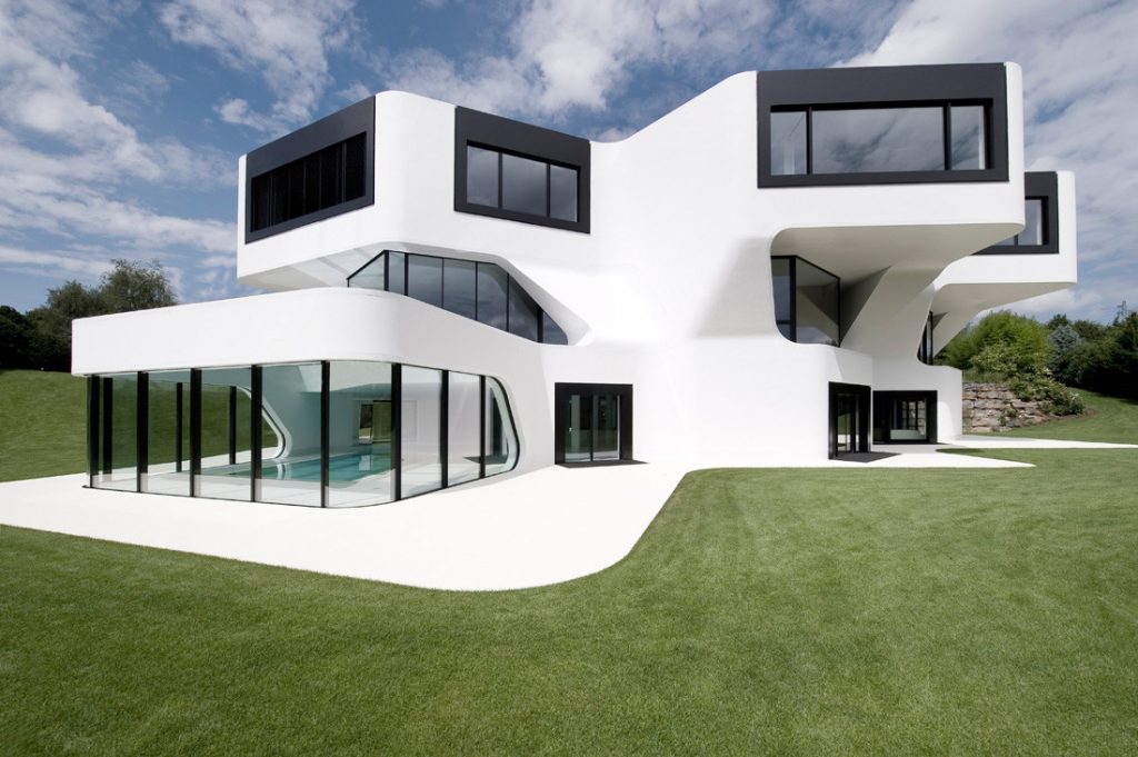
Dupli Casa, built by J. Mayer H. Architects in Ludwigsburg, Germany in 2008, this stunning design marvels with its sleek, smooth lines, and breathtaking ivory skin
Not Bad Design, But Design On Purpose
Many people think that a Brutalist website is just a poorly built one. But the most important difference is purposefulness. Both may seem “rough,” but a poorly designed site is the result of not having enough expertise or forethought. A really Brutalist site is a design choice that was made very thoughtfully.
Great Brutalist sites nevertheless put readability, easy navigation, and a natural user flow first. They show that a design may be striking and hard to use at the same time. For example, platforms like Gumroad and Figma have effectively combined parts of this design to make a user experience that is both unique and very useful, but still seems new and different. The rough edges and bold strokes aren’t faults; they’re part of a planned style that gives off an air of honesty and purpose.
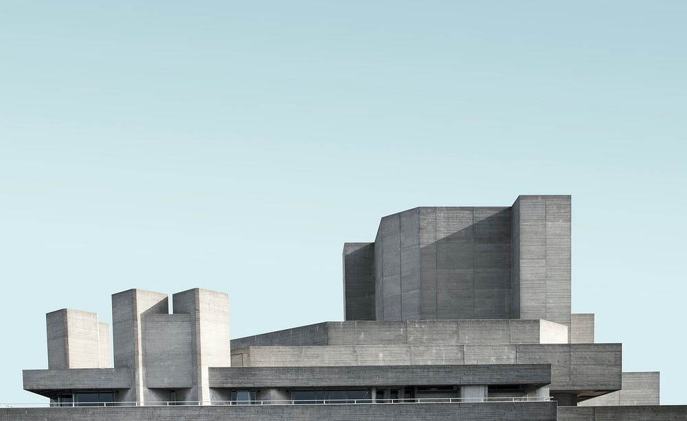 National Theatre by Simone Hutsch
The Future Needs Work
Neubrutalism will have an even bigger impact on online design as it changes over time. It’s a strong reminder that design isn’t only about how things look; it’s also about how they communicate, their philosophy, and their brand identity. The style provides a chance for businesses, artists, and creators that want to stand out to go against the grain and create a brand that people will remember.
The future of the Internet is going to be more real and less filtered. Minimalism’s clean, sleek lines will probably stay, but Brutalism’s raw, expressive power will confront them. Websites of the future might not look “pretty” in the usual sense, but they will be honest, useful, and true to themselves. In a world that is becoming more and more alike, this is a trend worth cheering.
References
Webflow Blog | Web Design, Development, Web Strategies
Neubrutalism designs, themes, templates and downloadable graphic elements on Dribbble
For more content like this CLICK HER!